Zoya Zuza Swatch

I'm normally not a huge fan of blues, but Zoya Zuza blew me away (pun intended). Zuza is part of Zoya's summer 2012 Surf collection, which has some really great colors (I now own Kimber, Rory, and Zuza).

Zoya describes Zuza as: "Deep, saturated, oceanic turquoise with gold and silver metallic shimmer and a foil-like finish." Their description is perfectly accurate. Zuza is a light aqua blue with hints of green, it has large silver metallic shimmer that is reminiscent of foil, but the particles are too large for a foil.

The ormula was great, opaque in two coats but not overly shiny. Very pretty and soft finish on this one with the large shimmer particles that make it really unique.


Click if you want to see the shimmer/foil particles:

Zoya Sooki Swatch

Do you ever get in a kick? Where all you want to wear on your nails is glitters/shimmers/jellies/cremes? I'm definitely in a creme phase. For a while I was crazy for glitters but now I'm digging the smooth perfect shine that you can only get from a creme or a jelly.

This one is Zoya Sooki, a bright cherry red creme! I know that it looks very similar to Zoya Carmen, but it is quite different. Sooki is a more orange-toned bright cherry red, while Carmen is toned down a bit. Carmen is more of a crelly while Sooki is definitely a creme. Sooki's formula is also much nicer than Carmen, it covered in just two flawless coats.


I just love these reds. For a long time I wouldn't touch a red nearly this bright, but now I can't seem to get enough. It's so bright, so flawless, so pretty.


Just look at that shine! I can see the reflection of clouds. :)


I picked up Zoya Sooki as part of Zoya's 50% off earth day promotion. I had no idea about this promotion before I saw all of the bloggers posting about it, so if you missed out, just wait til next year!

Julep It Girl Intro Box Review

What a horrible blogger I have been this week! I have been finish up my graduate classes and trying to get organized for summer research and I ran out of backup posts. Well I'm back now and I have plenty to show you. I've purchased quite a few wonderful indie polishes from Etsy and purchased supplies to do my own frankening.

Today I'm going to show you my Julep Maven It Girl Intro box. I decided after much debate to try out Julep nail polish. I've seen Julep all over the place but never wanted to fork out the cash ($14 + shipping for one bottle of nail polish?). While browsing the internet, I saw the penny deal: get a Julep Maven intro subscription for just $0.01. Seems too good to be true right? Well it's not. I checked my credit card statement and I was charged for $0.01 exactly! There doesn't seem to be any catch to this awesome deal. They shipped it to me fast and here are the results!

The Julep Maven It Girl intro box came in this cute little packaging


With a nail file and three bottles of nail polish, Heather, Mandy, and Helena.

Heather
Helena
Mandy


First up is Heather, described as: "chic platinum greige with a metallic glow." I'd say this one is a graphite grey metallic shimmer. The finish has obvious brushstrokes, but with careful application that wouldn't be a problem. Two coats + base coat for this photo. Heather really isn't a "me" color but it is pretty and the application was great.


Mandy is my favorite of the three, described as: "fresh, bright, deep coral-pink." This color is absolutely amazing. It's such a pretty color and just says SUMMER to me. It looks beautiful and bright on my fingers and I can imagine it would be a great pedicure color. It's a bit more pink than some corals (such as OPI's On Collins Ave) and did I mention absolutely gorgeous? The formula was perfect, thick and pigmented, this is two coats and top coat with no base coat.


Helena is equally gorgeous, described as "ultra-saturated fuchsia. Looks great on all skin tones." It's a great fuchsia, and it didn't significantly darker than the bottle color. In my experience most polishes this color dry matte and much more red than the bottle color, but Helena is pretty bottle accurate. This photo, on the other hand is not color accurate. I tried it outside, inside, fluorescent lighting.. but my camera can't seem to capture this color.


This is the color of Helena:


I used to think that Julep bottles looked a bit awkward because they are long, narrow, and square. After having some they are really quite nice! They have thick glass, so they are really nice and solid. The bottles nest together nicely because of the square sides and the narrow squared lid has the perfect grip for manipulating the brush. Aren't they nice?


I'm quite impressed with these three Julep polishes. The bottles are nice, the brush is great, the formula was near perfect: two coats that self-leveled and dried smooth. One quick coat of top coat and they were a shiny perfect dream. I might just have to wait and see what next month's box is like...

Preview!

Hey Y'all!

Just a preview of some of my recent mail, more fun to come as soon as I finish my finals tomorrow and have some time to post!

Here is my very own packet of Spectraflair holographic pigment for frankening! I've been wanting this for a long time so it's great to finally own some... now what to try first!


The other preview is a peek of one of my new Dollish Polishes on my thumbnail in the above photos I got my Dolish Polish order and I'm so happy!


China Glaze Fast Track Swatch

Now here is a polish that I won't be hanging on to. I'm not a huge fan of nude or natural looking polish, but I was really excited for a nude polish with gold shimmer. One thing I do know about "natural" colors is that they need to match your skin tone, everyone has a perfect mannequin hands polish, and sadly this is not mine.

I love the idea of China Glaze Fast Track. Fast Track is a light tan creme with gold flakes. Fast Track is definitely a creme, the formula covers easily in just two coats. It's from the Hunger Games (Capitol Colors) collection and I love nearly every polish I've tried from this collection, but Fast Track and I just don't get along.


The polish is very pretty, and it might just be your perfect shade!

Zoya Carmen Swatch (Photo Heavy)

Zoya Carmen is described as: "Bright, clean medium true red in a glossy creme finish."

To me Carmen is a nice medium red, not too bright but not dark either. The formula reminds me more of a jelly than a creme, and the super shiny finish is typical of a jelly... but Carmen is opaque in two coats and is definitely a creme.

I had a few problems with the application, the formula is very thin for a creme and flooded my cuticles easily. The polish didn't level itself out very well with two coats so I ended up adding a third to try to get that super smooth glossy finish. It dried pretty quickly so three coats wasn't a problem at all (I'm just a lazy habitual 2-coat girl). With three coats, the polish was level and smooth but I had a few careless air bubbles. A coat of my trusty SV leveled it all out and hid any imperfections.


The color is perfect. It's just the right color red for my skin tone and I couldn't be happier. Perfect. Classic. Red. I think I'm in love!


I think Carmen just replaced OPI Vodka and Caviar as my favorite red. Although for once OPI has the coolest name (who doesn't love vodka?). ;)


Isn't it just gorgeous? I see now why Zoya chose it as the color for their NYC Times Square add.

**Photo from zoyanailpolish.blogspot.com**


... and a close-up. So shiny!

Wet n Wild Wet Cement Swatch.

Wet n Wild Megalast Wet Cement is actually the only grey I own! I'm not a huge fan of grey, but I knew that I needed one in my collection so I picked up Wet Cement. It is a nice taupe-grey creme. It was a great choice--easy formula, opaque in 2 coats (shown below), fast dry time, good wear time--I've got no complaints!


I actually kinda like how grey looks on me. It's just not flashy enough for a girl who loves her red. :)


Sally Hansen Xtreme Wear Set The Stage layering

A few days ago I decided to layer glitter over the bright Essie Aruba Blue (sapphire blue with silver frost). I picked up Sally Hansen Xtreme Wear Set The Stage on the sale rack at my local Walgreens and I love the combination. I got tons of compliments on this mani from unexpected people and random strangers!

Set The Stage is a sparse glitter (intended as a glitter top coat) with small gold glitter pieces and large gold hexagons. I used two coats here and somehow it looked like stars on a bright blue sky.


Essie Aruba Blue before the top coat.

Nail Mail!

I came home today to find two wonderful packages, my order from Zoya and a package from my mum.

So breaking into the Zoya package (this is my first order from Zoya) I was pleasantly surprised to find biodegradable packing peanuts (this is a big thing for me as I hate styrofoam... once you've seen the pacific garbage patch you will understand why).


Inside was a nice little box filled with beautiful polish. My five bottles all came nestled within the same box.


And there you have it, Zuza, Kimber, Maisie, Gloria, and Carmen. What to wear first? I currently have China Glaze Red Stallion as a mani (great color, shiny orange-toned red metalicy-frost). Red is my go-to color and I needed a little boost with so much stress this week!

CG For Aubrey & WnW I Need A Refresh-Mint Comparison

As promised here is my comparison between China Glaze For Aubrey and Wet n Wild Megalast's I Need A Refresh-Mint.

Can you tell the difference?


I can.

Since I have a busy schedule I had to wear this comparison as a full mani for a day. I opted to use Four Aubrey on my index, middle, and pinky fingers and I Need A Refresh-Mint on my ring finger (as an accent nail in case there was a significant difference in color). In person the difference is subtle, but it's there. I doubt anyone else noticed, but the China Glaze is a touch darker than the Wet n Wild and the Wet n Wild has a touch more of a green hue.

Are they dupes?
not quite...
Can you get away with just one in your collection?
probably...

I'm not a huge fan of the "Tiffany Blue" mani, I prefer darker colors and I might offer up For Aubrey in my next blog sale. One is enough for me.

Quick Swatch! Spoiled Dive Deeper

Dive deeper is a dark blue glass fleck with a hint of teal not quite apparent in these photographs. The glass flecks are sliver, and this polish definitely has depth! (Pun intended). This is a great blue, I love the name and I love it!


Essie Poppy-Razzi Collection Swatches and Review

Today I have a whole collection to share with you! Yes I know I said I wasn't buying any new polishes this month... but I really couldn't help it!


This is Essie's Summer 2012 collection of neons called Poppy-Razzi. The four shades are Lights, Camera, Action, and Bazooka. This collection seems to stick to the fashion colors this summer with coral-pinks and oranges.


Direct Sunlight


Indoor lighting


Lights is a bright fuchsia pink. It reminds me of a neon version of "barbie pink" because it has that slight blue hue. The closest pink I own is China Glaze Pool Party, but Pool Party is a much brighter highlighter pink and leans more towards orange than Lights (and has a streaky formula). I almost didn't buy this color and it might be my favorite!


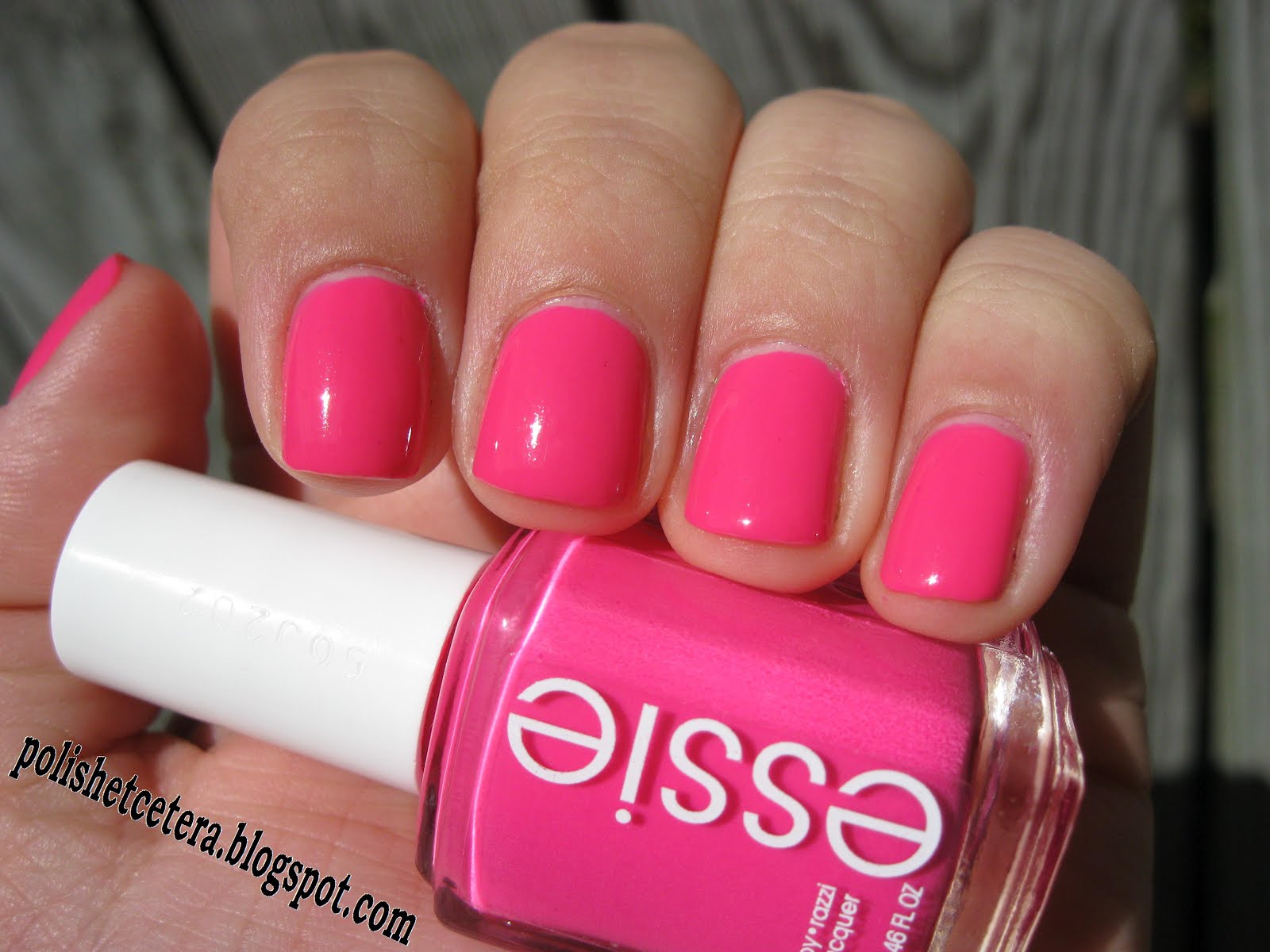
Camera is a neon pink coral - sort of an orangish-pink color. This one is the most neon of the bunch and the picture doesn't do it justice. On the nail it just glows, and I'm sure it would look awesome over white.


Direct Sunlight


Indirect Sunlight


Action is a bright tangerine orange, much warmer and more peachy than the pictures show. It dries significantly darker than bottle color, which kind of disapponts me. I was looking forward to this one the most, as a pale yet neon pigment-packed orange, it was unique. The bright orange is still very pretty but not as unique as the bottle color, and doesn't work with my skin-tone very well but it's a fabulous orange I will be wearing again.


Bazooka is neon orange. It is easily a 2-coater and the most opaque of the bunch. I don't really have much to say about this one, it is a nice medium orange with a lot of pigment. Very bright and quite pretty.


Overall I am really impressed with these polishes. Although the colors aren't terribly unique I think they will be quite popular. The formula was quite fantastic for neon polish. I used 3 coats of each, but I easily could have gotten away with just two coats for most of them if I was more careful with application. The polish wasn't streaky and was self-leveling, even with my horribly impatient application.

All of them dried to a semi-gloss finish rather than matte as neons typically are. They all had more of a jelly finish than a neon finish. I haven't seen the official Essie description as to whether they are supposed to be jelly-like. Either way I hope that this means better wear times than matte neon polish. They all looked incredibly gorgeous and shiny with a coat of Seche Vite. Action had the worst formula compared to the rest, but was still very easy to work with.

*Aren't my changing backgrounds obnoxious? I spent all day yesterday chasing the sun on a "mostly cloudy" day!*

Dive Flag / SCUBA mani!

I can't believe I never thought of this before! I'm always looking for the perfect "ocean blue" polish, but I never thought of a SCUBA manicure before now. I absolutely love it! It is so simple yet spectacular.

I started out with Maybelline's new Color Show line with the beautiful blue crelly called Shocking Seas on 4/5 fingers. For my ring finger i used Wet n Wild Wild Shine French White Creme, and waited for it all to dry. I then used tape to make a small diagonal line down my ring finger and covered the whole nail with Sally Hansen Insta-Dri Rapid Red (a bright red creme).


Oh, and here is what a dive flag looks like if you don't already know. :) It's bright red with a white diagonal stripe running from the upper left to the lower right corner. It is a sign for boaters that they must remain > 30 m from the flag at all times.


Here is Maybelline Shocking Seas on its own. It's a nice color and the formula was impressive. I used two coats that applied like butter and dried quickly. The brush on these is short and narrow (reminds me a bit of Essie brushes). They are a bit more $$ than what I normally spend on drug store polishes (gotta love $1 polish) but worth it for the formula. This is the first one I own and I'm sure to get more.


I think I originally bought this polish because their new bottles are so cute and aerodynamic. :) If you haven't seen them yet I'd suggest keeping your eyes open for the Color Show polishes. (Although these are 7 ml bottles and retail for about $5

Nicole by OPI A Million Sparkles

A Million Sparkles is a total glitterbomb. It has a clear base and a variety of glitter. There are small blue hexagon glitter, small blue bar glitter, larger pink bar glitter (2x the size of the blue bars), and large yellow-gold hexagon glitter. 

The color is predominantly aqua blue, but with the glitter all different sizes and shapes it's truly amazing and totally unique. I used three coats to reach opacity, but the polish level in my bottle dropped dramatically for just one mani. 


The formula was a bit clumpy and difficult to work with and once dry it ate top-coat like only bar-glitter based glitters seem to! (I had the same problem with OPI Save Me!)

... click it.. you know you want to see all of those glitter particles...